The Future of CSS
The Future of CSS
...or at least, some of it.
- Images!
- Images 4!
- Lists!
- Flexbox Layout!
- Grid Layout!
- Values!
- Selectors!
- Variables!
- Maybe more?
- Q&A
Gradients have changed over time…
- Linear gradients now use bearing angles (0deg is N, 90deg is E)
- Syntax of both linear and radial gradients has slightly changed:
linear-gradient(to top left, red, white, blue);
radial-gradient(5em circle at top left, red, white, blue);
Gradients have changed over time…
Corner-to-corner gradients are now "magic".
Old behavior of to top right:
|
|
| New behavior:
|
|
The image() function
Basically a souped-up url()
image("foo.webp", "foo.svg", "foo.png")
image("foo.png", blue)
background: image(rgba(0,0,255,.2)),
            url(foo.jpg)
image("foo.png#xywh=40,60,20,20", "sprite.png")
Use an element as an image!
Conical Gradients!
conic-gradient(red, yellow, lime, cyan, blue, magenta, red)
image-set() function!
image-set("normal.png" 1x, "high-res.png" 2x, "print.png" 10x)
Lets you specify multiple resolutions of an image,
and the browser will automatically choose which one to download,
based on the screen's resolution
and the current network speed.
Lists!
Revival of an old 2003 spec
http://dev.w3.org/csswg/css3-lists
- Defines the
::marker pseudo-element
- Lets you directly style/position/etc the marker
- Defines 100+ new list styles
- Lets authors define their own list style
Defining your own list-style
@counter-style leaves {
  type: repeating;
  glyphs: url(star1.jpg) url(star2.jpg);
  suffix: '';
}
|
✩  One
✪  Two
✩  Three
✪  Four
✩  Five
|
@counter-style binary {
  type: numeric;
  glyphs: 0 1;
}
|
1.    One
10.   Two
11.   Three
100.  Four
101.  Five
|
Defining your own list-style
@counter-style dice {
  type: additive;
  additive-glyphs: 6 ⚅, 5 ⚄, 4 ⚃, 3 ⚂, 2 ⚁, 1 ⚀;
  suffix: ’‘;
}
⚀    One
⚁    Two
⚂    Three
...
⚅⚄   Eleven
⚅⚅   Twelve
⚅⚅⚀  Thirteen
Flexbox!
Basically, display:block for applications.
Dumps much of the text-related complication in favor of simpler, more useful abilities.
With luck, it will have gone to CR earlier this morning.
Chrome has an implementation (unstable while the newest updates percolate through the versions). Other browsers will be following shortly.
We should have unprefixed versions in every browser (except maybe IE) by the end of the year!
http://dev.w3.org/csswg/css3-flexbox
Easily make whole-page apps with dynamically-sized sections
Thousands of household uses!
Horizontal navigation bar
<style>
  ul {
    display: flex;
    justify-content: space-between;
  }
  li { flex: 1; }
  li { flex: none; }
</style>
<ul>
  <li><a>Products</a></li>
  ...
  <li><a>News</a></li>
</ul>
- Products
- About Us
- Store
- News
- Products
- About Us
- Store
- News
Grid Alignment!
Finally, a layout system designed for pages.
Slice the page into cells, and position elements into those cells.
No extraneous markup, no source-order dependence, fully flexible.
http://dev.w3.org/csswg/css3-grid-layout/
Grid Alignment!
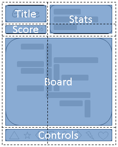
grid-template: "a c"
               "b c"
               "d d"
               "e e";
#title { grid-cell: a }
...
Grid Alignment!
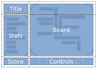
grid-template: "a d"
               "c d"
               "b e";
#title { grid-cell: a }
...
Values & Units
http://dev.w3.org/csswg/css3-values/
This spec defines all the basic value types that CSS uses across its specs
Also defines the syntax used in property descriptions, if you ever wondered what the hell "&&" meant in a spec.
Some useful new units
rem is the em from the root element
ex is relative to the font's x-height, similar to the em
ch is the width of the "0" (an 'average character')
vw, vh, vmin, vmax units are relative to the size of the window
The calc() function
Lets you do math in CSS, combining things that are comparable
calc(20px + 3em + 40%)
calc(100% / 7)
linear-gradient(to right, white, silver calc(50% - 10px), silver calc(50% + 10px), white);
The attr(), cycle() functions
attr() lets you pull values from attributes on the element
Useful for implementing the UA stylesheet, or for styling based on data-* attributes
width: attr(data-size px, 100px);
toggle() takes several values, and "toggles" between them with each nested use
em { font-style: toggle(italic, normal); }
ul { list-style-type: toggle(circle, square, dot); }
Column pseudos
In HTML, the column of a cell is indicated implicitly, rather than directlly through nesting. This makes it impossible to style an element based on its column, except for the 4 properties that the spec allows <col> to have.
td:col(col.foo) selects the cells within the column that matches "col.foo"
td:nth-col(n) and td:nth-last-col(n) work in the expected way
Link pseudos
:any-link is :link done right - matches both visited and unvisited links
:local-link matches links to elsewhere in the same page
:local-link(n) matches based on subsets of the path - :local-link(0) looks only at the domain, :local-link(1) looks at the domain and the first segment of the path, etc.
Time pseudos
Only useful for presentation formats that are time-based, like karaoke captions in an HTML <video> or a screen reader
:current matches the current active element
:past and :future matches elements that have already been passed, or haven't been hit yet, respectively
video::cue(:past) { color: red; }
video::cue(:future) { color: white; }
/* Bouncing ball left as an exercise for the reader */
The Reference Combinator
Lets you follow IDREF attributes in the selector, like <label for=foo>
label:hover /for/ input { outline: thick dotted red; }
:nth-match() - selector indexing
li.foo:nth-child(even) doesn't do what you want...
li:nth-match(even of .foo) does!
Why so long?
Previously, discussion was paralyzed by indecision and argument.
Now we have agreement on the solution, and are starting experimental implementations.
Syntax will probably still change some - I expect to nail it down at the meeting next month.
Var Example
:root {
	var-header-color: #006;
	var-main-color: #06c;
	var-accent-color: #c06;
}
a { color: $main-color; }
a:visited { color: $accent-color; }
h1 {
  color: $header-color;
  background: linear-gradient($main-color, transparent 25%);
}
CSS Nesting!
Stylesheets often have tons of repetition in the selectors.
"#main > header > h1", "#main > header > h1 > a",
"#main > header > h1 > a:visited", etc.
Verbose, hard to read, prone to hard-to-see errors
Old and Busted
#main > header > h1 {
  font-size: 2em;
  background: blue;
  color: white;
}
#main > header > h1 > a {
  color: #ddf;
}
#main > header > h1 > a:visited {
	color: #fdf;
}
Nesting Example
#main > header > h1 {
  font-size: 2em;
  background: blue;
  color: white;
  & > a {
	color: #ddf;
	&:visited {
	  color: #fdf;
	}
  }
}
Just syntax sugar for the long-form stuff.
Again, CSS preprocessors led the way.
Shorter stylesheets, better organization mean faster app development.
Explicitly indicates scoping opportunities, which might be useful for browser
perf