image-rendering
Provides hints to the browser about how it should scale images.
auto | |
pixelated | crisp-edges |
and I work at Google.
...or at least, some of it.
Defines several useful image-related features.
Level 3 is in CR, and features are showing up and unprefixing as we speak.
linear-gradient(to top left, red, white, blue);
radial-gradient(5em circle at top left, red, white, blue);
Corner-to-corner gradients are now "magic".
Old behavior of to top right:
| |
|---|---|
| New behavior: |
conic-gradient(red, yellow, lime, cyan, blue, magenta, red)
Color and position can be in either order.
white 20%===20% white
A color-stop can have two positions, defining a "stripe"
red 33%, white 33%, white 67%, blue 67%===red 33%, white 33% 67%, blue 67%
Omit the color and have it automatically computed for you, for making non-linear transition curves
black, #333 5%, #666 10%, #999 15%, #ccc 20%, white===black, 5%, 10%, 15%, 20%, white
image() functionBasically a souped-up url()
image( "foo.webp" type(image/webp) , "foo.svg" type(application/svg) , "foo.png" type(image/png) )
image("foo.png", blue)
background: image( rgba(0,0,255,.2) ), url(foo.jpg)
image( "foo.png#xywh=40,60,20,20" , "sprite.png")
image-set("normal.png" 1x, "high-res.png" 2x, "print.png" 500dpi)
Lets you specify multiple resolutions of an image, and the browser will automatically choose which one to download, based on the screen's resolution and the current network speed.
Use an element as an image!
<canvas>-driven) backgrounds on your headings
<linearGradient>, <radialGradient> and <pattern> for now, but more coming in the future!)
Smoothly fade between two images. Already works in WebKit//Blink (with an older syntax), and is used by CSS animations!
cross-fade( <percentage>? <image> [, <image> | <color> ]? )
Provides hints to the browser about how it should scale images.
auto | |
pixelated | crisp-edges |
Phase 1 of making CSS actually handle layout
Dumps much of the text-related complication in favor of simpler, more useful abilities.
Been in CR for a while, and Firefox and Chrome are already unprefixed.
flex-flow
order
justify-* and align-* properties
flex
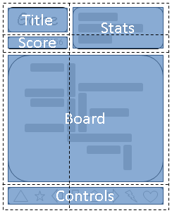
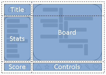
Finally, a layout system designed for pages.
Slice the page into cells, and position elements into those cells.
No extraneous markup, no source-order dependence, fully flexible.

grid-template: "a c"
               "b c"
               "d d"
               "e e";
#title { grid-area: a }
...

grid-template: "a d"
               "c d"
               "b e";
#title { grid-area: a }
...
http://dev.w3.org/csswg/css-values/
This spec defines all the basic value types that CSS uses across its specs
Also defines the syntax used in property descriptions, if you ever wondered what the hell "&&" meant in a property grammar.
rem is the em from the root element
ex is relative to the font's x-height, similar to the em
ch is the width of the "0" (an 'average character')
vw, vh, vmin, vmax units are relative to the size of the window
Lets you do math in CSS, combining things that are comparable
calc(20px + 3em + 40%)
calc(100% / 7)
linear-gradient(to right, white, silver calc(50% - 10px), silver calc(50% + 10px), white);
attr() lets you pull values from attributes on the element
Useful for implementing the UA stylesheet, or for styling based on data-* attributes
width: attr(data-size px, 100px);
toggle() takes several values, and "toggles" between them with each nested use
em { font-style: toggle(italic, normal); }
ul { list-style-type: toggle(circle, square, dot); }
http://dev.w3.org/csswg/selectors/
The first module to hit level 4!
Selectors are getting pretty powerful now
In HTML, the column of a cell is indicated implicitly, rather than directlly through nesting. This makes it impossible to style an element based on its column, except for the 4 properties that the spec allows <col> to have.
col.foo || td selects the cells within the column that matches "col.foo"
td:nth-col(n) and td:nth-last-col(n) work in the expected way
:any-link is :link done right - matches both visited and unvisited links
:local-link matches links to elsewhere in the same page
:local-link(n) matches based on subsets of the path.
Example: Github urls are of the form http://github.com/[user]/[repo]/[file]
Lets you follow IDREF attributes in the selector, like <label for=foo>
label:hover /for/ input { outline: thick dotted red; }
li.foo:nth-child(even) doesn't do what you want...
li:nth-match(even of .foo) does!
table.foo td p.bar,
table.foo th p.bar {
  ...
}
table.foo :matches(td, th) p.bar {
  ...
}
Variables! In CSS! OMG!
A common request for literally over a decade.
Previously, discussion was paralyzed by indecision and argument.
Now we have agreement on the solution, and are finishing experimental implementations. Shipping has been delayed, but should proceed soon.
:root {
	var-header-color: #006;
	var-main-color: #06c;
	var-accent-color: #c06;
}
a { color: var(main-color); }
a:visited { color: var(accent-color); }
h1 {
  color: var(header-color);
  background: linear-gradient(var(main-color), transparent 25%);
}
http://dev.w3.org/csswg/css-color
New Color draft includes a bunch of new functionality requested by authors, and some lessons from preprocessors.
hwb() (hue-whiteness-blackness) is a more intuitive variant of HSL
gray() lets you specify grays compactly and without repetition.
color() function lets you adjust colors, a la preprocessors, but live. Very useful with variables.
Throwing out the old & busted media types, in favor of new and more useful media features.
| Pointer | |||
|---|---|---|---|
| course | fine | ||
| Hover | yes | Wii-mote | Mouse |
| no | Touch | Cintiq (pens) | |
More are possible, such as ability to animate (distinguishes print/e-ink from normal screens). Let us know if you have more ideas!
Nesting is a mainstay of preprocessors like Sass, but has some grammar ambiguities that make it hard to handle in real CSS.
Finally resolved with "nesting block", simply wrapping the rules in {}:
foo {
	color: red;
	{.bar { color: blue;}}
	{&.baz { color: yellow; }}
	{qux & { color: green; }}
}
CSS suffers from an all-too-common problem - its solutions are big and tailored, and if you deviate too far from the ideal, tough luck.
Violates the ideas of the Extensible Web Manifesto.
CSS is complex and perf-sensitive, though.
Polyfilling will proceed in small steps.
Seems obvious and easy
@custom-media foo (min-width: 500px) and (max-width: 1200px);
@media ("foo") { ... }
CSS.customMedia.set("bar", true);
CSS.customMedia.set("baz", 500);
CSS.customMedia.set(
     "qux",
     MediaQueryList("(min-width: 500px)"))
@media ("bar") { ... }
@media ("baz" < 600) { ... }
@media ("qux") { ... }
Ask Me Anything - I Am A Spec Writer