The layout
Let's say I have a moderately complex site that I want to create on the web. My mockups are all ready, and I've identified the skeleton of the site:
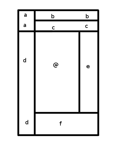
This diagram is drawn from an actual site that I am looking at to make sure my requirements are sane when I start hacking on the layout specs. Each labelled section is a distinct part of the page.
The Flexbox Approach
If I was designing this layout with flexbox, I'd end up with a page structure looking like this:
("vbox" and "hbox" are container elements with display:box and an appropriate box-align value.)

<vbox>
	<hbox>
		<a/>
		<vbox>
			<b/>
			<c/>
		</vbox>
	</hbox>
	<hbox>
		<d/>
		<vbox>
			<hbox>
				<@/>
				<e/>
			</hbox>
			<f/>
		</vbox>
	</hbox>
</vbox>
Personally, I think this is relatively horrifying all by itself. The page layout is relatively complex, but this super-nested design is just... just... ugly. And while I might be able to use existing elements in my page for some of those vboxes and hboxes, I'll still have a ton of container elements that serve no purpose beyond making the layout work. <div>itis!
Here's where it gets worse, though. Say I change the layout slightly. Rather than the D block extending to the bottom of the screen, I go with a more traditional 3-column layout in the center, and just let the footer fill the entire bottom. In terms of visual change, all that happens is the lower-left corner of the layout now belongs to F rather than D. What happens?
CHAOS!
Suddenly, I have a relatively drastic rearranging of my markup:
<vbox>
	<hbox>
		<a/>
		<vbox>
			<b/>
			<c/>
		</vbox>
	</hbox>
	<hbox>
		<d/>
		<@/>
		<e/>
	</hbox>
	<f/>
</vbox>
While this layout is simpler than the prior one, it's still a bit overly complex and will require meaningless container elements to make the layout work. More importantly, though, it's significantly different from the previous layout, even though almost nothing changed!
(To be fair, it could be a relatively small change, if I'm willing to retain the now-useless vbox and hbox wrapping the @ and E blocks. But it's pretty obvious that the structure above is precisely what you'd produce if you were coding this from scratch, and so if you happened to make the change in the opposite direction the large change would be required.)
Flexbox seems fundamentally vulnerable to this. It can only deal with one-dimensional flows of elements, so certain types of layout changes that break from those simple notions can create a cascade of changes as you suddenly need to nest multiple flexboxes that are only positioning two or three elements.
The Template Approach
With Template Layout you're saved from this. To start with, here's the extra structure you need:
(this space intentionally left almost blank)
This is because the layout is expressed in pure CSS, not in the page structure. Here's the CSS for the original layout:
body {
	display: "abb"
	         "acc"
	         "d@e"
	         "dff";
}

#logo { position: a; }
#header { position: b; }
(etc.)
Notice the eery similarities between the display property and the original file...
Now, here's what the CSS looks like if we make the change in how blocks D and F sit:
body {
	display: "abb"
	         "acc"
	         "d@e"
	         "fff";
}

#logo { position: a; }
#header { position: b; }
(etc.)
(In case you missed it, a single character changed.)
Conclusion
Flexboxes are great for a lot of things, and I think I'm going to be powering them up a little to make them even better, but they are not the correct solution for page layout. Template Layout is.
 CC0 license
Thank you for your article.
Can you please explain in more detail the "Template Approach"? Can these CSS boxes handle complex dynamic content? Browser support? Appropriate for "responsive" designs?
Also, would CSS Templates be appropriate for developing a complex nested layout in XUL? Or is Flexbox the way to go? Would there be an appropriate mix?
Thanks for your time.
Reply?
For more detail, you'll want to read the Grid Layout spec.
Yes, they can handle complex content. No browser supports them yet, but there are several implementations in progress. They are absolutely appropriate for responsive designs, and in fact will make responsiveness unbelievably simpler to deal with.
Grid Layout will be great for arbitrary websites and applications, so it should be fine for XUL too. You can nest grids inside of grids, for example, so you can have different components defining their layout with grids, then the overall page placing the components themselves in the page grid.
As I explain in the post, Flexbox is great for 1d layout, when your boxes should be laid out in a line. Grid is for 2d layouts. These should absolutely be mixed - pages will almost always want to use Grid, but a lot of the time individual components will want Flexbox, which is more powerful within the simpler area that it covers.
Reply?
I’d like to point out that the first section of the article appears to have a formatting error: the Markdown shows up instead of the URL’s image itself.
This is a fascinating article, and happened to coincide with a rereading of the manual of Shoes, an old GUI-building toolkit by the Ruby language community’s Why the Lucky Stiff, which was intended for beginner programmers. Shoes’ approach to graphical layout used a vertical stacks and horizontal flows, each of which was one-dimensional similarly to flexbox. I now realize that their common flaw often requires dramatic changes to their nesting structures whenever something needs to extend past one more neighbor.
Reply?
So, in other words, a grid layout with colspan and rowspan capabilities. Funny how we keep coming back to the stuff we figured out when tables were new in the late 90s.
When display:table was introduced I was pretty excited, hoping to do exactly what you describe here, but they have too many limitations. Seems to me we could accomplish this grid system by simply relaxing some of the restrictions on table layout styling, rather than adding a whole new layout module that'll take five or six years to reach consistent mainstream usage.
I admit the declarative syntax of your template example is a lot more convenient to work with, but nothing quite so simple is part of the actual grid proposal.
Reply?
I originally thought that we could just make table layout better too, but when you dive into it, table layout is CRAZY NUTS. Much better to start fresh with a well-defined layout algorithm that does exactly what you want.
I don't know what you mean by "nothing quite so simple is part of the actual grid proposal". Grid lacks the
@special slot in Level 1, but that's it. Everything else translates directly into existing syntax.Reply?
body { display: "abb" "acc" "d@e" "fff"; }
#logo { position: a; } #header { position: b; } (etc.)
Reply?
Aren't you trying to use FlexBox for a non-flexible layout? Of course, for that, it's the wrong tool.
FlexBox is great for simple, modern, dynamic content wrapping, resizing and responsive design.
Things you can hardly do with any of the other ways (grid, display:table..., media-query).
Reply?