A gradient is a browser-generated image specified entirely in CSS, which consists of smooth fades between several colors. There are two basic kinds of gradients currently defined, linear and radial. These are specified by the linear-gradient() and radial-gradient() functions, and can be used any place an image can currently be used.
In many places this specification references a box, such as "the box's top-left corner" or "the box's right side". In all of these circumstances, the box refers to the rectangle that would be filled by an SVG image without intrinsic dimensions used in the same context. See the CSS 2.1 spec for clarification on this.
Linear Gradients
A linear gradient is created by specifying a line and then several colors placed along that line. The image is constructed by creating an infinite canvas and painting it with the gradient-line, repeated infinitely in both direction perpendicular to the line and scaled to the box by the starting-point and ending-point.
linear-gradient() syntax
linear-gradient(<gradient-line> / <color-stop>, <color-stop>[, <color-stop>]*);
The <gradient-line> stands for:
[
  <bg-position>? <angle> [ inside | outside ]?
|
  <bg-position> [ to <bg-position> ]?
]
The first construction sets the gradient-line's starting point, then lets the ending point be defined by the angle specified. An angle of 0deg points straight right, and 90deg points up. If <bg-position> is specified, that is the gradient-line's starting point. If it is omitted, the gradient-line's starting point is one of the box's corners, based on the (normalized) <angle>. If the angle is between [0deg,90deg], the starting point is the bottom-left corner. If the angle is between [90deg,180deg], the starting point is the bottom-right corner. If the angle is between [180deg,270deg], the starting point is the top-left corner. If the angle is between [270deg,360deg], the starting point is the top-right corner. The ending point is determined by extending the gradient line from the starting point at the specified angle. If inside is specified, the end point is where this traced line intersects the opposite box edge. If outside or no keyword is specified, the end point is the point on the traced line just before where a line drawn perpendicular to the traced line would be completely outside of the box.
In the second construction, the starting point is specified by the first <bg-position>, and the ending point is specified by the second <bg-position>. The <bg-position> construction is specified in CSS3 Background and Borders Module. If the second <bg-position> is omitted, it defaults to a point obtained by rotating the starting-point 180 degrees around the box's center.
If both starting-point and ending-point are the same, then the gradient is just a solid color, defined by the furthest color-stop (see below). For example, "left top 90deg", "left top to left top", "center center" will all result in a solid-color gradient.
The <color-stop> stands for:
<color> [ <percentage> | <length> ]?
The color-stops are points placed along the line defined by the gradient-line at the beginning of the rule. Percentages refer to the length of the gradient-line, with 0% being at the starting point and 100% being at the ending point. Lengths are measured from the starting-point in the direction of the ending-point. With either measure, color-stops may be placed before the starting-point or after the ending-point; this is perfectly valid, as the starting-point and ending-point are just convenient references, and do not directly interact in the display of the gradient. At each color-stop, the line is the color of the color-stop. Between two color-stops, the colors are interpolated as SVG gradients. Before the first color-stop, the line is the color of the first color-stop. After the last color-stop, the line is the color of the last color-stop.
If the first color-stop does not have a <length> or <percentage>, it defaults to 0%. If the last color-stop does not have a <length> or <percentage>, it defaults to 100%. If any other color-stop does not have a <length> or <percentage> specified, then all adjacent color-stops without a <length> or <percentage> are collected together, and then evenly spaced between the color-stops on the boundaries that do have a <length> or <percentage>.
If multiple color-stops fall on the same point, they produce an infinitesimal transition from the one specified first in the rule to the one specified last. In effect, the color suddenly changes at that point rather than smoothly transitioning.
Color-stops must be specified in order. If a color-stop ever specifies a position that would place it before an earlier color-stop, it instead uses the position of the previous color-stop. It is recommended that authors not mix different types of units, such as px, em, or %, in a single rule, as this can cause a color-stop to unintentionally try to move before an earlier one. For example, the rule linear-gradient(left / red, yellow 100px, blue 50%) would work as expected as long as the gradient's block was at least 200px wide. If it was 150px wide, however, the blue color-stop would resolve to "75px", before the yellow. Instead, the blue defaults to 100px, same as the yellow color-stop.
Linear Gradient Examples
All of the following examples are applied to a box that is approximately 100px wide and 200px tall.
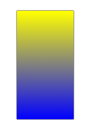
###Example 1 - a basic vertical gradient
background: linear-gradient(top / yellow, blue);
background: linear-gradient(top to bottom / yellow, blue);
background: linear-gradient(-90deg / yellow, blue);
background: linear-gradient(top left to bottom left / yellow, blue);
background: linear-gradient(top / yellow 0%, blue 100%);
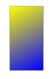
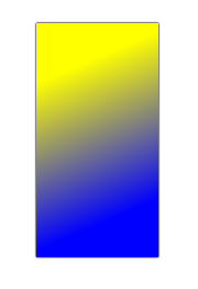
###Example 2 - a basic corner-to-corner diagonal gradient
background: linear-gradient(top left / yellow, blue);
background: linear-gradient(top left to bottom right / yellow, blue);
background: linear-gradient(0 0 to 100% 100% / yellow, blue);
###Example 3 - a basic angle gradient using inside
background: linear-gradient(-45deg inside/ yellow, blue);
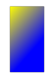
Notice the large quantity of pure blue in this image, caused by the ending-point of the gradient-line being in the center of the box's right side.
Also, in this particular case linear-gradient(top left to right / yellow, blue) would also create the given image, because of the specific dimensions of the box. If the box's dimensions were changed, the two could specify different images.
###Example 4 - a basic angle gradient using outside
background: linear-gradient(-45deg outside / yellow, blue);
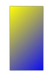
Notice how the preceding example is similar to the second example. In both gradients, the top-left of the box is pure yellow, and the bottom-right of the box is pure blue. The difference is in the angle that the gradient follows.
###Example 5 - a 3-color vertical gradient.
background: linear-gradient(top / yellow, blue, #0f0);
background: linear-gradient(top / yellow, blue 50%, #0f0);
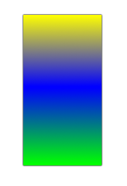
In this particular case linear-gradient(top / yellow, blue 100px, #0f0) would also create the given image, because of the specific dimensions of the box. If the box's dimensions were changed, the two would specify different images.
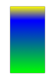
###Example 6 - a 3-color gradient with unevenly spaced stops
background: linear-gradient(top / yellow, blue 20%, #0f0);
###Example 7 - a gradient using a complex starting and ending point
background: linear-gradient(20px 30px / yellow, blue);
background: linear-gradient(20px 30px to right 20px bottom 30px / yellow, blue);
Notice that in this example a substantial portion of the image is pure yellow and pure blue, because the starting and ending points of the gradient-line are not on the box edge, but rather somewhere within the box.
 CC0 license